I hate parading my serenading | As I’ll probably miss a bar,| But if this ditty is not so pretty | At least it’ll tell you | How great you are.
– Cole Porter, “You’re the Top”
Creating Results’ Social, Silver Surfers e-book recently went live on Amazon and iBooks. This is the latest edition of a proprietary national study of Boomers’ and seniors’ digital marketing preferences. Three chapters explore what older adults do/don’t want from social media marketing, websites generally and housing/senior living websites specifically.
At times the picture the data paints isn’t so pretty.
Dissatisfaction with websites has risen with each edition of Social, Silver Surfers. Respondents have more to complain about and do so in greater volume.
Today we’re sharing insights which, if applied to website development, could help your organization become – if not the top – more effective with mature consumers.
(We’re also sharing lyrics from an infectious 1934 tune. Retro earworm! You’re welcome.)
Favorite Features of “Typical” Websites
You’re the top! You’re the Colosseum.| You’re the top! You’re the Louvre Museum.
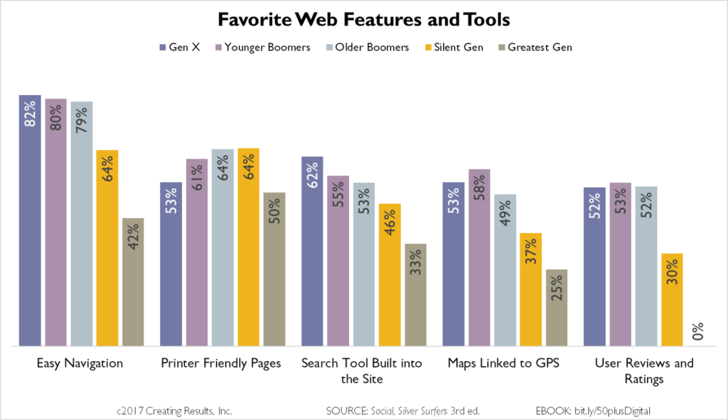
In each edition of Social, Silver Surfers we’ve asked internet users over 40 to tell us what features, attributes of tools they appreciate on typical websites.
I can hear you now – there are no “typical” websites.
While it’s true that there are a wide variety of websites out there, including e-commerce sites, news outlets, entertainment and so on, they each aim to deliver a positive web experience to visitors.
It’s also true that for silver surfers, there are some consistent items that make their online experiences positive.
- Easy Navigation – Ranked #1 in this edition, #1 in 2013
- Printer Friendly Pages – Ranked #2 in this edition, #3 in 2013, #2 in 2010
- Integrated Search – Ranked #3 in this edition, #2 in 2013, #1 in 2010
Younger web development professionals might be more focused on trends such as “ghost buttons” that blend into the background or infinite scrolling. However, going back to basics and addressing the three elements above can make a very big difference in how older visitors perceive your site – and how quickly they get to their goal (which hopefully includes conversion to captured lead).
These Favorite Features remove obstacles in the path between a senior and the information they need / desire to make a decision.
Maps Linked to GPS and User Reviews went from not-mentioned in previous surveys to top-five in this edition.
Still, Easy Navigation and Integrated Search Tools are tops among ALL generational cohorts. Search is especially important to time-pressed Gen X and Younger Boomers.
Website Pet Peeves
I’m just in the way, as the French would say “De trop, ” | But if, Baby, I’m the bottom, You’re the top.
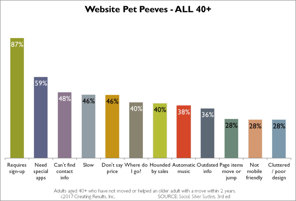
It’s appropriate that Porter used French to describe being not wanted, too much. Because the silver surfers we’ve surveyed are telling us they are “très fatigué.” Web developers are making decisions about content, design and functionality that are in the way of 40+ers finding the information they desire.
The number of pet peeves reported has grown over the years and silver surfers are, for the most part, increasingly dissatisfied.
The frustration with websites that don’t provide clear (or any) pricing information is even greater when it comes to real estate. As Richard Eisenberg reported for Next Avenue/Forbes,
“‘We’ve been doing studies of senior housing sites since 2010, and every year, people complain in significant percentages that the websites don’t reveal their prices,’ said Erin Read, research director at Creating Results, a consulting firm specializing in the 50+ market. ‘It defies logic for me.’
In Creating Results’ new Social, Silver Surfers study, 68% of people who moved into senior housing in the last two years complained that prices aren’t revealed on the sites; 75% of respondents who helped others make such moves (caregivers, family members) had the same beef.”
Several of Creating Results “top” team members will be at the LeadingAge Annual meeting in New Orleans later this month. They’d love to discuss the CCRC-specific digital marketing insights we gathered through Social, Silver Surfers. Click here to set a time to meet!
Making Websites Sing a New Tune
Want your web visitors to think “you’re the nimble tread of the feet of Fred Astaire … you’re camembert”?
Here are three important steps for making your web development more harmonious:
- Instead of testing older users’ patience, test your site design. Then do it again. Then analyze critical pages with heat maps and dig deep into analytics that show how users flow towards conversion … or whether they are stopped by too-cute or too-confusing navigation.
- Reconsider required sign-up. At what point and for what information should you request? Build a relationship and earn the trust of your prospect before asking for their contact information.
- Make it easier to connect. Your organization is spending significantly to drive interest in your products/services, and yet nearly half of all “typical” older users of “typical” websites complain they cannot act on that interest because they can’t find contact information. Put a large, easy-to-read phone number at the top of every page.
Implement these website development changes, and boomers and beyond may soon see you as “the top.”
Right, Cole?


