When we’re designing websites for older adults, a client sometimes will ask, “Can it have ____? I saw it on such-and-such’s website and it’s so cool!”
I’m a creative person so I like cool.
But I like results even more.
What’s cool and trendy can, at times, actually turn off the baby boomers and seniors our clients are trying to attract. These mature consumers don’t want fuss and bother. They want functional, easy-to-use tools that help them make decisions and take action.
That said, there are two “trends” I think are relevant to our older adult targets.
Flat Design – What Is It?
In a recent article for Instant Shift, Ben Novoselsky took on designers who stuff websites full of flashy animations, multidimensional effects, drop shadows and other flair.
He advocates for flat design.
With flat web designs, we create an interface that minimizes elements that feel like they’re 3D. The designer goes minimalist — flat colors, lots of open (white) space, bright colors, simple icons with clear borders/edges, and fonts that set a mood.
Novoselsky describes several important features of flat designs, including:
- “Simplicity– With no 3D effects and flash presentations, the focus is on creating simple designs, effective layouts, and clean interfaces so that users can have a seamless experience in navigating/browsing. Even though the flat designs look easy to construct, they are in fact tricky for developers who do not have a sound knowledge of the design principles.
- “Minimalism– Following the concept ‘less is more’, the principle of minimalism is used to avoid clutter and confusion. Yet again, the principles of UI/UX are kept in mind and just a few elements are used to design the app. Here the focus is more on content and uses rather than the ‘dressing up the website’.”
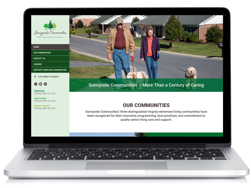
Because a flat design is committed to content / getting the job done, it is good for responsive websites as well. Good examples are found in Google’s web interfaces, or this web design for a soon-to-be-launched Sunnyside Communities site:

Flat Design – Why it Makes Sense for Seniors
I think flat design makes perfect sense for our target audience.
By eliminating all the flashy, faux-realistic structures and drop shadows, the older eye can stay focused on what is important without distraction. Internet users of all ages suffer from an ever-declining attention span. Flat design can help web visitors focus on what matters most to them (and to your business).
I also agree that color plays a big role in how users interact with websites. We try to use color consistently to present CTAs (calls to action) using colors that attract the eye.
Skeumorphism – What Is It?
I’m not sure how to pronounce it, but I’m sure it sounds awesome!
I’ll let the Interaction Design Foundation explain:
“Skeuomorphism is where an object in software mimics its real world counterpart. The “trash can” is, perhaps, the most recognizable skeuomorphic object. Though the good old “save” icon was once skeuomorphic but following the demise of the floppy disc – it no longer bears resemblance to the world of today.
Skeuomorphism began to take shape in the 1980s. One of its earliest proponents was Steve Jobs of Apple. The idea was simple; computer interfaces would be much more intuitive to users if skeuomorphic design was applied.
That trash can let users drag stuff they didn’t want on their computers to an actual bin. You could move files to folders (another real life equivalent). It meant that we weren’t baffled by all these new facilities because we had something to reference them against in real life.”
The web design community has fallen in and out of love with this trend over the years. Do we need a real world visual reference for an item if the concepts are so familiar to a digital world that they don’t really need an explanatory image any more?
These web designs typically take more time to load. Speed is everything online.
Skeuomorphism also became pitted against flat design. If you’re making a reference to a real-world item, it will have fancy edges and shadows and so on. Those are all considered “clutter” in flat design.
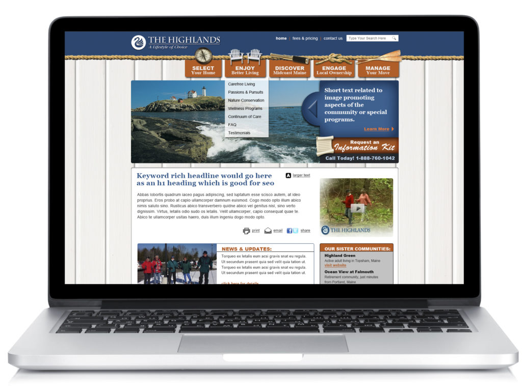
Here’s a senior living design-in-progress from many moons ago:

LOTS of real world references, such as chairs, compasses …
Skeuomorphism – Why it Makes Sense for Seniors
A Stack Overflow survey found that the average US developer is 31.6 years old. They’ve never known anything but the digital era.
Our clients are targeting prospects in their 60s, 70s, 80s. They’re still adjusting.
A “useless detail’ to a 30-year-old may actually improve the experience of an 80-year-old. Especially because as we age, our brains shift to the visual side and images can be processed faster/more clearly than words.
I don’t think it has to be all or nothing when it comes to flat design vs. skeuomorphic design.
A senior looking for a photo gallery will appreciate a camera icon that actually looks like a camera; just keep the icon simple. Contact us information? A great spot for a phone icon that is, perhaps, a little retro.
Web Design Evolution
I love flat design!
But, I personally struggle as a designer to give up the textures and drop shadows of my past.
I think my age may be showing, but it is something I have worked on every year I’ve been with Creating Results: simplifying my web designs. I’ve had some success and some failure.
Here is an older design, which was more skeuomorphic – check out the photos that “feel” like photos!

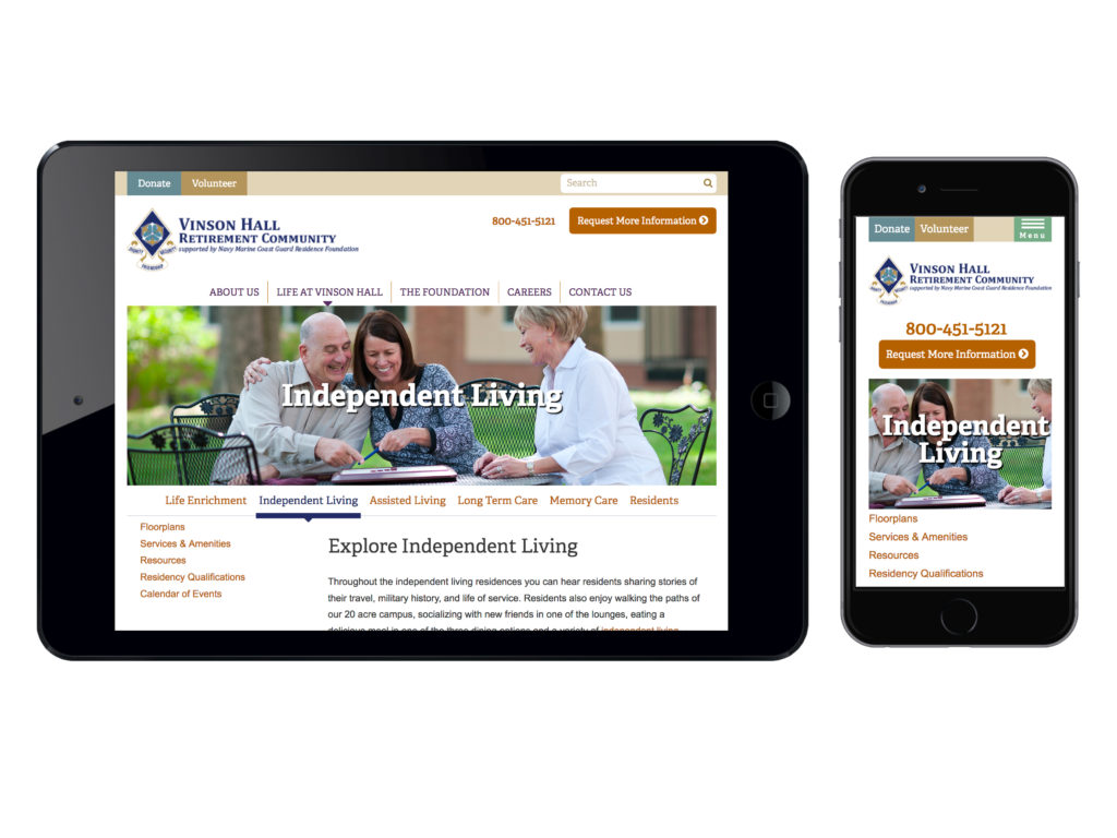
Compare that to a recent flat design for Vinson Hall, a continuing care retirement community (aka “life plan” community) in McLean, VA:

As we have learned more about older adults online and my own style has evolved, there are some client sites in a sort of intermediary place design-wise. There are some subtle dropshadows here and there and some skeuomorphic touches (a phone icon, for instance):

Where We Go From Here
Are these web design approaches a trend? Yes, definitely… but good trends that I believe will stay relevant for years to come.
As technology gets more complex, designers need to find a way to make interfaces even easier for older users. What that looks like I don’t yet know, but I am excited about various approaches we’re trying with our clients’ websites.


