


I recently attended the HOW Design Conference in Atlanta, where thousands of artists, designers and design enthusiasts from around the world gathered to celebrate and promote design in all its forms.
It was a great chance to absorb, learn and be inspired by this amazing, eclectic design community.
One particularly helpful session I attended was Design Globally–Think Locally, presented by Sagi Haviv from the New York agency Chermayeff & Geismar & Haviv (CGH).
Haviv shared a challenging logo design project that resonated with me because it was so similar to several real estate logo design experiences we’ve had at Creating Results.
Letting Go of an Old Friend
The firm was hired to do a logo redesign for the Prague Zoo, a landmark so popular that local residents visit two to three times a week. The zoo’s original logo included an illustration of a Przewalski’s horse, the last-surviving wild horse species and a well-known symbol for Prague. A copyright issue arose, so the zoo quite unexpectedly needed to create a new logo. Understandably, replacing the much-beloved horse logo was going to be a major challenge.
CGH’s new logo explorations – which contained no horse – were the result of much research, including a trip to the Prague Zoo, where the firm’s staff got to feed the giraffes. (OK, this makes me a little jealous. Anyone who knows me knows I’m a little obsessed with giraffes.)
The new logo featured footprints of various animal species to represent the many creatures in the zoo using primary colors and a modern font. It was a huge departure from the old, woodblock-style horse.
![]()
Naturally, there was resistance by zoo staff to a horseless logo concept, and several rounds of edits ensued. But the firm was able to bring their client along through the process of embracing the new identity and letting go of an old “friend” – a challenge we at Creating Results are all too familiar with.
The new zoo logo is currently featured on the zoo’s website and throughout its facilities.
“Respecting the traditions doesn’t mean designing to the tradition.” Sagi Haviv
Taking a long-standing logo and redesigning it can be daunting, especially when the stakeholders are so devoted to it. Such was the case of Traditions of America, a leader in 55+ active lifestyle communities in Pennsylvania.
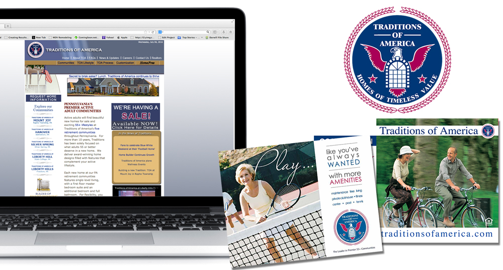 Featuring a bald eagle and arched window, their original logo was designed in 1997 when the company was founded. It was appropriate for the values and goals of 55+ homebuyers of the time. But to attract more design-conscious Baby Boomers in the 2000s, the logo needed to be refreshed.
Change is hard – for practical as well as emotional reasons.
The original Traditions of America logo was being promoted across all elements of marketing and signage in multiple communities, and it was embraced with pride by team members. We knew we had to be strategic, tactful and creative in winning over our client and their active adult prospects to a new identity.
We conducted a brand attribute survey across all Traditions of America communities to inform our development of multiple new logo options. Some of the resulting concepts reflected the original brand – with flourishes of laurel and patriotic colors – while other designs were more minimal, creating a clean look that reflected the carefree, active lifestyle offered by these retirement communities.
![]()
Audience testing was conducted to ensure the new logo selected would resonate with both real estate prospects and stakeholders. The results gave us the data we needed to “sell” the client on the best option for a brand identity that spans across all of their communities and subdivisions.
The reaction to the new Traditions of America brand (top logo in above explorations graphic) was immediate, and overwhelmingly positive. While the process was challenging, the results speak for themselves.
CLICK HERE TO READ THE FULL CASE STUDY.
Making Something Old New Again
Kaine Communities, a 50-year-old affordable homebuilding company in Maryland, also called upon Creating Results to freshen up an outdated brand.
Their existing logo, featuring a top hat and cane (a literal play on the company name) was not relevant to their new, luxury home target market. Prospects could have been turned off by the lack of sophistication of the existing brand.
During discovery we studied which aspects of the current corporate image held special meaning and value to the company, and determined where new elements should be introduced.
One big change was the name. We determined that Kaine Homes (rather than Kaine Communities) was a name more aligned with the luxury buyer.
Along with the name change, the top hat and cane magically disappeared, to be replaced by a custom-illustrated magnolia flower complimented by a customized, calligraphic (script) font. To help promote the new brand across its different communities, our team suggested that magnolia trees should be planted by at each new Kaine Homes build.
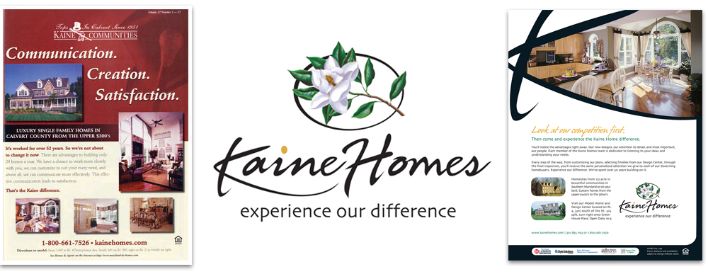
The new logo helped Kaine Homes renew the energy of their identity and strategy, and successfully propelled sales of their luxury homes.
CLICK HERE TO READ THE FULL CASE STUDY.
What, Why & HOW Takeaways
WHAT lessons do these three case studies have for your real estate logo design?
The HOW conference strengthened my commitment to Creating Results’ discovery process.
At Creating Results we work with each new client to identify their unique brand attributes. We spend significant time on preliminary research to identify the USPs (unique selling points) of a product or company to better understand what elements will heighten brand awareness and inspire loyalty.
We also recommend testing a variety of logos with prospects and stakeholders to ensure that the brand experience will be a positive one, and to get buy-in from all parties.
WHY take the time for research and testing?
Change is hard, but we have proven that if the right steps are taken from the start, the road to success will be a much smoother ride.