Older adults are living in the digital world — just like the rest of us. A 2017 study conducted by Limelight shows that 47% of people ages 60+ spend more than 15 hours per week of their personal time online. This percentage is the second highest of any demographic. Surprisingly, it’s not Millennials or Gen Z spending the most time online — it’s adults ages 46-60, 48% of whom spend more than 15 hours online each week.
What to Consider When Designing Websites for 55+ Prospects
With digital media firmly entrenched as a part of everyday life, having a content-rich website is no longer a choice. It’s a necessity. To meet and exceed this standard for 55+ prospects, we recommend planning and designing websites for 55+ prospects with these three key aspects in mind to ensure visitors to your site get the best digital experience possible:
- User Experience and Content
- Visual Design
- Site Performance
Following best practices in these three areas will help you better capture and hold your prospects’ attention during their purchase journeys.
1. Crafting the Ultimate User Experience
At Creating Results, our first order of business when developing and designing websites for 55+ real estate/active adult clients is creating a seamless user experience for site visitors. As UXPlanet puts it, “User experience (sometimes referred to as UX) is all about how we perceive it, how we use it and how we remember it.”
The way in which your website’s architecture is laid out is encompassed in user experience principles. Think of your website as a virtual welcome center. As a virtual welcome center, your website should be arranged as meticulously as a brick-and-mortar one. There should be a methodology to how you define the various pathways and interactive elements on your site, their placement and the role each will play in moving your prospects towards the desired action — think completing a form to download an eBrochure or scheduling a tour.

Additionally, when designing websites for 55+, site content should be dynamic, organized logically, easy for readers to consume and created to provide them with the information they’re looking for. Copy should be written to align with your community’s voice/tone and incorporate the key messaging points and unique selling propositions outlined in your brand communication strategy.
2. Visual Design That Captures Your Prospect’s Attention
Visual design is closely aligned with UX and works best when it provides cues for the user to take the desired next action, be they subtle or direct.
For example, if the goal of a landing page is to encourage site visitors to subscribe to a newsletter, a subtler approach may include having an image of a person looking in the direction of the form. The direction of the person’s focus will act as visual cue to the user, and they, too, will be directed to the form. A more direct approach would be placing an arrow on the page pointing to the form. Users will see this and recognize that this is where you want them to transfer their focus.
The quality of photography and videography on your website is also of great importance when designing websites for 55+. If the site’s visuals are low quality, or don’t capture the user’s attention, it’s likely they’ll leave the site before ever getting to the copy. As we stress to our clients, your website should showcase your community’s homes and amenities using professional photography, as well as capture the type of lifestyle prospects will enjoy should they become homeowners.

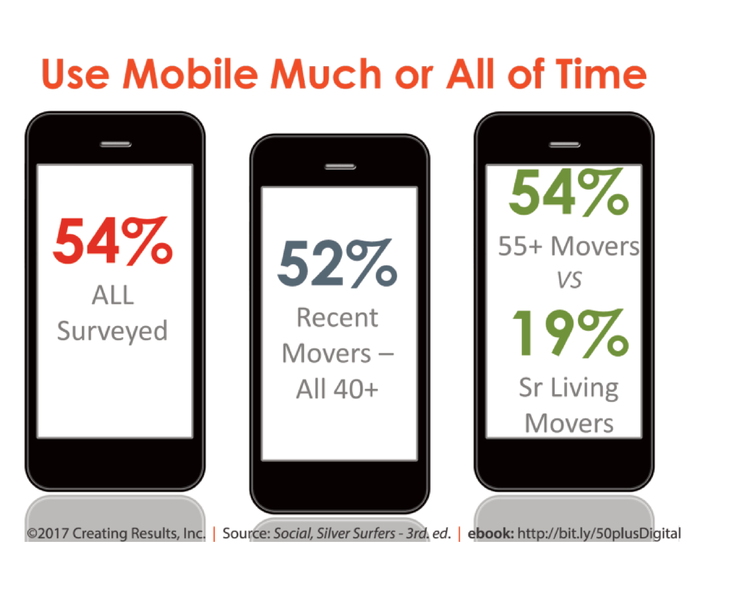
But even beautiful photography can’t cover up poor UX. In Social, Silver Surfers, our national study detailing the digital behaviors of adults ages 55 and over, more than half of all participants said they access the web from their mobile devices. This means that, when designing website for 55+ prospects, creating a mobile experience that’s as intuitive and seamless as the desktop experience is a must. In recent years, we’ve taken a mobile-first approach when developing websites for our clients. This ensure that distorted images, navigation difficulties and other pitfalls that might turn prospects off are avoided on mobile devices (as well as desktop).
3. Enhancing Your Site Performance
What do you usually do when a website takes too long to load? Most people, including your prospects, will focus their attention elsewhere if a site takes more than five seconds to load. According to this Google study, sites that load within five seconds experience 70% longer sessions, 35% lower bounce rates and 25% higher ad viewability than sites taking 20 seconds or more to load.
Site performance is one of the foundations of a positive user experience when designing websites for 55+ prospects. Your site can have amazing photos and compelling content, but if its performance is poor, your prospects will never see any of it. As a best practice, we use several tools daily to monitor our clients’ websites and ensure there are no issues with site performance.
A solid user experience, visual design and site performance comprise the framework on which your website — your community’s virtual welcome center —is built. With this framework in place, you can move forward to the next step: developing a strategy to drive traffic to the site and associated landing pages.
For additional digital marketing insights for attracting the 55+ consumer, be sure to follow us on LinkedIn and Twitter!


